
#husITa18/#SWSD2018: Visualizing Data: Infographics for Teaching and Learning about Social Welfare
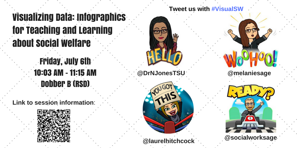 Today is the first day of 2018 Social Work, Education & Social Development Conference in Dublin, Ireland, and my first international social work conference. My first presentation will be with colleagues Nathalie Jones, Melanie Sage, and Todd Sage. We are presenting on the use of infographics in the Social Work curriculum on Friday July 6, 2018 at 10:03 AM in Dobber B of the RSD. This blog post does a few things. First, it offers an example of infographics as a tool for improving digital literacy with social work students. We also provide copies of all the presentation slides and handouts. Finally, this post helps us share and better disseminate our research findings.
Three of us (Nathalie, Melanie & Laurel) have been using infographics as an assignment in our classrooms for several years and have even collected some data across our universities to ask students about the pros and cons. Guess what? The students overwhelmingly love infographic assignments. They appreciate working their creative muscles, like the opportunity to learn a new and transferable skill, and say they’ll use infographics again. Also, the technology can be a little bit frustrating, and some students are uncomfortable with the lack of structure. We argue that it’s good for students to sometimes get uncomfortable with lack of structure- this experience of managing some ambiguity is an important practice skill, as we know well!
We have shared this work in a variety of ways with our colleagues (from conferences to listservs & Twitter to water cooler conversations) in the US and are excited to bring infographics to an international conference. In a previous blog posts, we offer assignment details and even rubrics you can use to build your assignments if you are a social work educator. We share these in the spirit of service to our profession and to support your work. Here are links to these posts:
– #BPDNOLA17 – Visualizing Data: Infographic Assignments across the Social Work Curriculum: This post includes copy of the infographic assignment and links to tutorial videos.
– Teaching with Infographics: My experiences with digital literacy and non-traditional students: In this post, Nathalie provides details about how she incorporated infographics into her classroom.
Below you’ll find our conference proposal and a link to our slides. We’d love it if you joined us on Friday, July 7th and shared your comments and experiences about using infographics in the classroom.
Assignment Handout: https://tinyurl.com/InfographAssignment
Presentation Slides:
Proposed Learning Outcomes: We will engage participants in discussions about how they are using infographics already and how they can introduce them in their current settings. We will answer questions during a short tech walk-through and provide take-away resources.
Conference Proposal: In our information-heavy world, people often consume data and information in snapshots. Infographics are visual stories. Although social service practitioners are often seen as communication experts, they often do not know the best ways to communicate using technology.
According to the theory of experiential learning, ideal learning happens in contexts that offer active experimentation alongside reflective learning. Bloom’s Taxonomy suggests higher-order thinking skills include creating, designing, and producing information, whereas classroom assignments often reinforce lower-level thinking such as interpreting, explaining, and comparing. Better assignments would include situations where students can experiment with product generation for real-world situations, reflect on the relationship between theory and practice, and receive feedback. Educators can create these situations by incorporating infographic assignments, while simultaneously offering transferable skills that support sustained public engagement beyond the university, and even globally.
Large government agencies frequently employ experts to create infographics to communicate information. However, small social services agencies often do not have resources to devote to such efforts. Practitioners who have technology skills are important for sustaining communication with today’s stakeholders, from clients and consumers to policy makers. Social services settings can use infographics to share how their money is spent in annual reports, as a tool to educate clients about positive mental health practices, or to help policy-makers understand issues facing people who are marginalized.
In this workshop social work educators will share how they implement and evaluate infographic assignments in courses across the social work curriculum, demonstrate software used to create infographics, and share ways infographics can be used in social services agencies as tools to advocate, educate, and disseminate.
How to cite this post:
Hitchcock, L.I., Jones, N.P., Sage, M. & Sage, T.E. (2018, July 4). #husITa18/#SWSD2018: Visualizing Data: Infographics for Teaching and Learning about Social Welfare
[Blog Post]. Retrieved from: https://laureliversonhitchcock.org/2018/07/04/husita18-swsd2018-visualizing-data-infographics-for-teaching-and-learning-about-social-welfare/